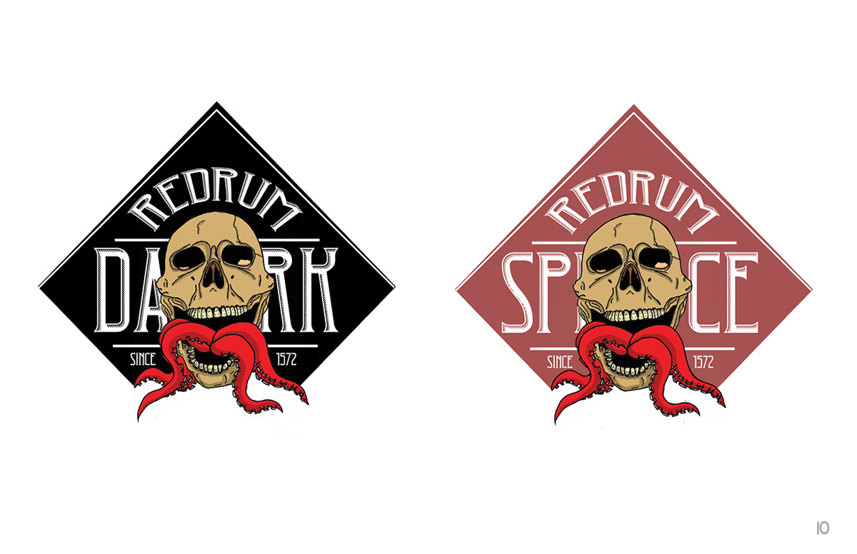
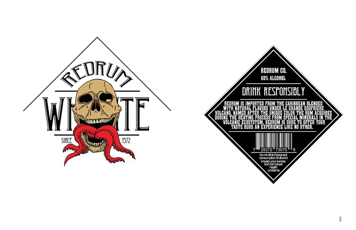
RedRum is a design concept in which a cohesive brand was to be created with the creation of a product and an ad. The brand takes inspiration from tales of pirates and sea monsters due to the product of choice, rum. It consists of one ad, three logos and a back label.
The logos were sketched with pen and paper then scanned into illustrator. The decision was made to keep the rough lines on the logos because they matched the aesthetic and story of the rum. The logo was meant to show an octopus coming out of the mouth of a smiling skull to subconsciously show a good time while keeping the story of pirates in the brand. The font was chosen based on the era the rum was supposedly created and the shape of the label was chosen to make the logo the center of attention and let it play with the text.
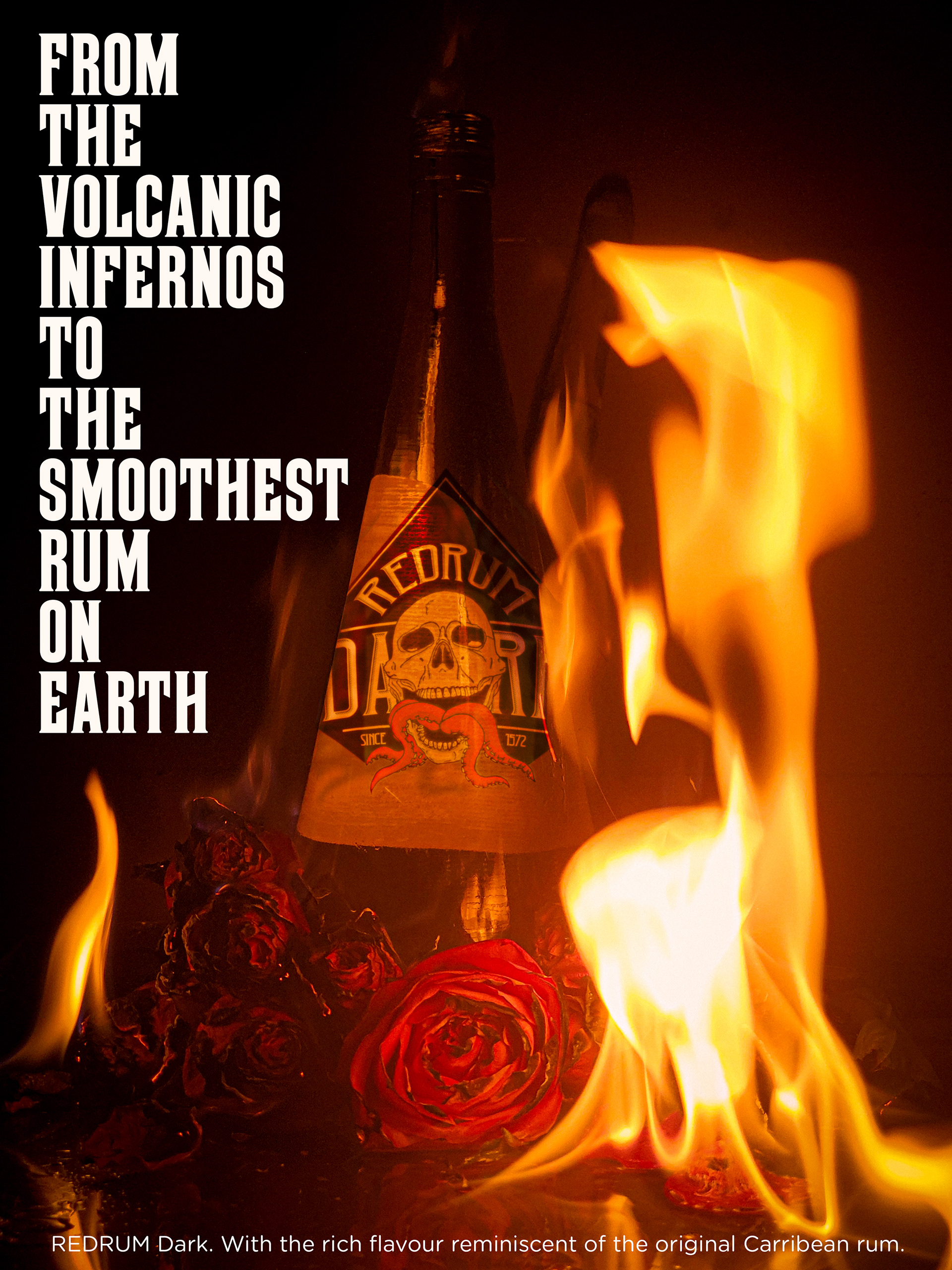
Out of all the assets for the project, the ad was the hardest to get just right. A set was made on top of a glass table; a glass bottle was placed in the center of the table and was surrounded with dry and live roses. Alcohol was splashed all round to help produce bigger flames and tie back to the idea that the rum was produced under a volcano. Everything was staged as a pyramid to bring the attention to the bottle and then it was set on fire. Different exposures were used in a span of 15 seconds and then compiled in photoshop, producing the final piece.